
Disney Plus Logo Update: A Subtle Nod to Hulu Merger
 Mar/28/2024
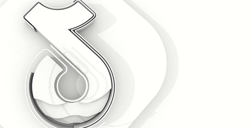
Disney has recently refined the visual identity of its Disney Plus streaming service, introducing modifications that subtly hint at its impending merger with Hulu. The most noticeable alteration is the shift to a new teal or seafoam backdrop, skillfully blending Disney Plus's original vibrant blue with Hulu's characteristic green. This strategic update, now visible on the Disney Plus website and app store displays, serves not only as a gesture of cohesion with Hulu but also imbues the brand with distinctiveness amidst a competitive streaming landscape dominated by monochromatic logos. While the transition from the deeply symbolic royal blue, reminiscent of Disney’s iconic Cinderella castle logo, to a modern hue may evoke a sense of nostalgia loss for some, it reflects the evolving dynamics of streaming services. The redesign, which includes a simplification of the logo’s curved swoosh to a solid white, signifies a departure from the whimsical elements that once defined Disney Plus's identity. This change, though practical from a corporate perspective, might lead to perplexity among international subscribers unfamiliar with Hulu, marking a significant pivot in Disney’s branding strategy. This visualization compares the old Disney+ logo (left) to the rebranded logo (right).